c/o Nicole Lee
The second-to-last week of the art studio theses kicked off on Wednesday, April 16, following the champagne pop on the steps of Olin Memorial Library. Each of the vastly different pieces focused on the interaction between space and the things that occupy it. Some exhibits were entirely sculptural, featuring massive structures that invited viewer interaction, while others mixed sculpture with drawn and/or painted pieces, creating an overall interplay between 3D and 2D art forms.
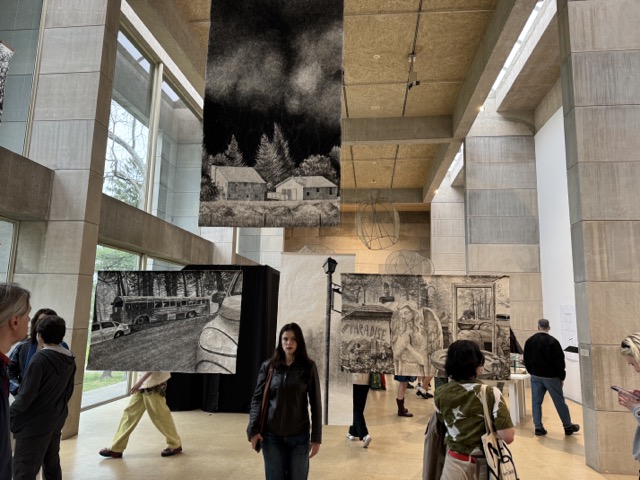
The first exhibit one saw when entering the Ezra and Cecile Zilkha Gallery, “Woundwood” by Claudia Kunney ’24, beautifully meshes the traditional Japanese artform of sumi-e with distinctly American imagery and landscapes. This evocation of Americana—the school buses, pickup trucks, and sweeping, wooded vistas—was intentional.
“Basically, my thesis is about the wildfires in Paradise, California in 2018,” Kunney said. “And I’m trying to communicate that sort of ghostly, spectral sense through the fact that the paintings are on partially transparent paper, [and] they’re black and white.”
Kunney’s paintings of Paradise were hung at various heights and locations across her section of the Zilkha Gallery. Sumi-e is traditionally done on fine, thin paper, and in suspending her works in the air, Kunney allowed the light from the gallery’s floor-to-ceiling windows to filter through paper, creating a gorgeous interplay between the ink and the midday light and achieving the ghostly, spectral effect Kunney was aiming for.
Ghosts, and the idea of haunting and being haunted, featured prominently in Kunney’s examination of Paradise and how the wildfires affected the community.
“What I noticed about this incident, and about the town afterward, is that the town and its residents were never really permitted to recover and create a new narrative around themselves in their homes,” Kunney said. “And that was something that I was really interested in exploring—this sort of concept of the town, its residents, being frozen in time.”
Kunney’s chosen medium worked beautifully to help her achieve that goal. “Woundwood” is a haunting tribute to a town seemingly frozen in time, unable to recover from the incident that brought it to its knees six years ago.
Further into Zilkha was “Holy Diffusion” by Ish Sillah ’24. The exhibit featured process-and-planning illustrations and photographs, which were displayed both on a table and along the walls. The centerpiece, however, was a massive structure, positioned right in front of the gallery’s windows. Sillah’s thesis, like Kunney’s, played with light.
When I emailed Sillah to ask about his process and intent, I was shocked to learn that the dark structure through which I had walked during the reception was, in fact, a chapel. This had been the first week (of the weeks I had been able to make it to) where I had seen exhibitions that leaned architectural.
“I chose architecture because I believe that all architecture is home to something,” Sillah wrote in an email to The Argus. “So I tried to construct a chapel that was home to divine light…. Once I settled upon the wall of what I imagined to be the gates of heaven opening up, I then started to form the structure around the light wall.”
The title of Sillah’s thesis, “Holy Diffusion,” beautifully encapsulates this statement of intent. The main structure, a construction of wood and dark fabric, invites the viewer to walk within it. Within the structure, the angles in the wood slats allow light from the windows to peek through, allowing for a glimpse at the light and world just outside of the chapel. It provides a beautiful, startling contrast to the structure’s solemn outer appearance—walking into Sillah’s chapel, you feel as if a veil has just been pulled back, allowing light—be it holy, natural, or otherwise—to live within both the chapel and within you.
“I want the viewer to feel like even in a space as small as my chapel, they can feel they are entering heaven, without even realizing it,” Sillah wrote. “If someone wanted a relationship with God, it could easily happen in that space because the architecture aided that process. If they didn’t want a relationship with God, they would still want to be in space because they thought it was beautiful.”
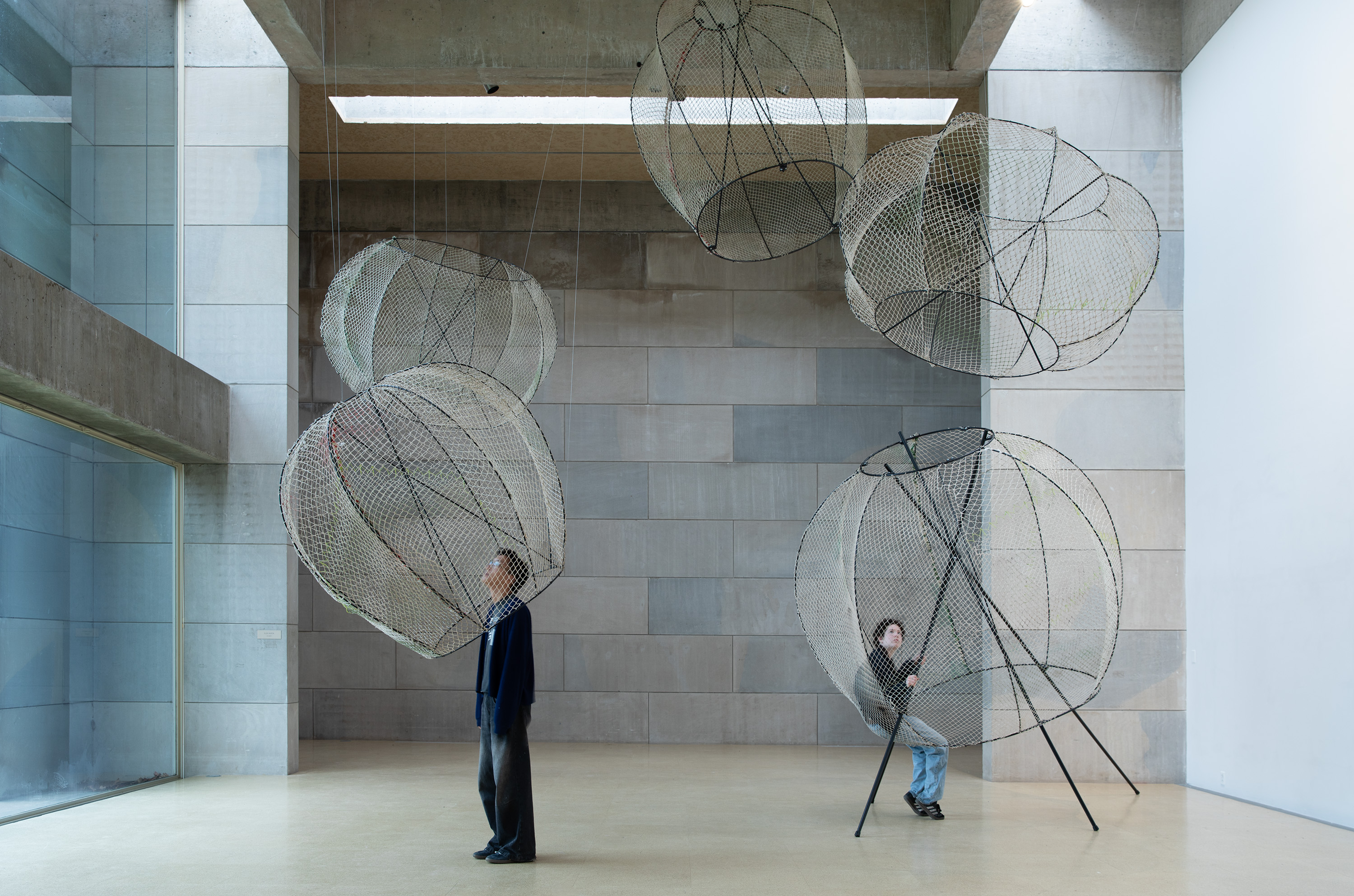
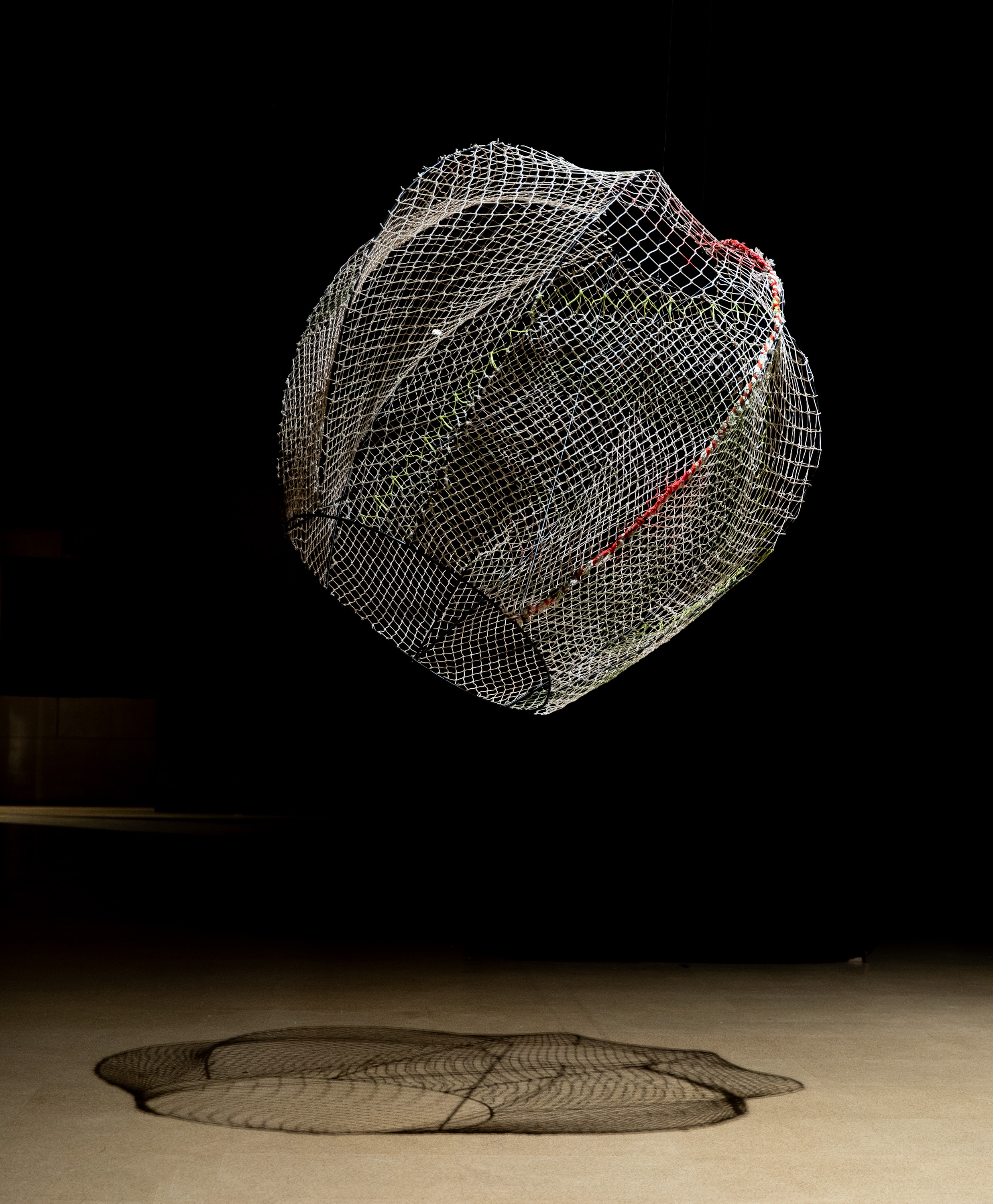
The closed-off outer appearance of Sillah’s chapel provided a stark contrast to the exhibit that occupied the furthest space in the main wing of the Zilkha gallery: “IN MESH” by Eliza Austin ’24. Composed of a series of spheres made of woven netting, Austin’s installation was an exercise in airiness. Despite how large the spheres were, the open weave and mid-air suspension of all but one of the spheres made the exhibit feel weightless, as if you had walked in on them mid-flight.
c/o Eliza Austin
However, for Austin, the most exciting aspect of the installation was the act of building it.
“I am someone who gets really excited by a material, in this case steel and fish netting, and wanted to repurpose it into something that looks really fucking cool,” Austin wrote in an email to the Argus. “I really love the process and problem solving aspect of architecture and fabrication and I hope people can see a bit of my process in my work.”
Up close, the intricacies of Austin’s creative process become much more apparent. From afar, the orbs appear to be made of simple netting—and you would be forgiven for assuming that Austin had woven them of either hemp rope or some other fiber. But the materials Austin used were nothing so textile.
“I originally wanted to use brand new netting and tried to source it from InCord, which is a local netting manufacturer that has worked with artists before,” Austin wrote. “I ended up talking to my Environmental Studies Advisor, [Director of the College of the Environment] Barry Chernoff, who recommended I source fish netting. After a few trips to Narragansett, Rhode Island I had bundles and bundles of old (and free!) netting that was used to catch squid! This netting was also so beautiful because it had years of repairs—hints of green and red rope were tied into various parts of the netting and made it far more interesting to look at.”
Like Sillah, Austin also wanted to create an exhibit that both was beautiful and invited viewer interaction.
“As an architecture concentration, I really wanted to build a large(r)-scale structure that people could use or interact with, something that was for or about community,” Austin wrote. “In my initial models, my senior seminar class told me that the netting reminded them of spider webs. I thought more about netting as a “web” and how a web is essentially a series of connections, and how that is almost reminiscent of a community.”
You couldn’t interact with Austin’s installation in the same manner as Sillah’s, but Austin promised that the intent was there.
“If you look at my project, it is essentially five ‘orbs,’ four of which hang and one that sits on the ground,” Austin wrote. “The one on the ground is what I refer to as ‘the giant chair.’ This was by far the hardest part of the project—making something look so delicate but also have enough structure to hold people’s weight. It was tricky and I didn’t let anyone use the giant chair in the gallery out of fear of it breaking, but I promise it’s a working chair, and that was the most rewarding part of my thesis.”
The final exhibit was tucked away in Zilkha’s alcove and the almost entirely windowed corridor that leads to it. “WZÒR” by Varia Voloshin ’24 featured patchwork panels of clothing over the windows of the walkway and a large, painted depiction of the patchwork panels lay on the ground like a thin carpet.
These patchwork panels were smaller iterations of the main event: a massive curtain, hung from the ceiling, made entirely of patchwork cloth. In an email to The Argus, Voloshin talked about her decision to construct her installation out of this material.
“So my concentration in studio is technically product design,” Voloshin wrote. “The challenge with this discipline is unlike other concentrations, you kind of need to invent or discover the material you want to be working with…. While home over winter break, I started getting really interested by the wear and tear of clothing. More specifically, I was curious about where people form holes or tears on their clothing, why certain areas of clothing might become stained, and what this can tell about how a piece of clothing was worn.”
The “fabric monster,” as Voloshin called it, also has an element of viewer interaction. Walking around the massive hanging reveals an opening in it, which invites the viewer to take a step behind the curtain. While surrounded by the fabric, you are able to see, up close, the condition of the clothing Voloshin had repurposed to create her thesis—down to each and every little imperfection, all of which were cast into stark contrast by the bright, relentless light from above.
c/o Eliza Austin
“My thesis explores the relationship between people and their clothing,” Voloshin wrote. “I wanted to make observers think about how they form bonds with their clothing, and how garments transition from being something loved and worn to something being worn out and thrown out.”
And what of the oil painting that led viewers to the “fabric monster?” When I saw it for the first time, I couldn’t help but be struck by the contrast it provided: monochrome, as opposed to the riot of colors present in the patchwork panels, 2D rather than 3D. But what stuck with me the most was how apprehensive I felt walking around it, as opposed to the lack of fear I felt when touching the patchwork construction to enter into the curtain.
“By placing a painting, something typically associated with fine art and craftsmanship, on the floor and suspending sewn-together old garments from the most visible area in the gallery space, I was hoping to invite viewers to think about how something we consider as disposable or no longer useful can be given a second life—in this case, in the form of art,” Voloshin wrote.
The final senior thesis exhibition was housed in the Zilkha Uncommons—a room just off the main entrance into the gallery. Upon entering the Uncommons, you were greeted by a massive self-portrait of the artist, Eleonor Andersson ’24, staring impassively at you from the opposite wall.
Andersson’s thesis, titled “O.C.V.: A Self-Reflexive Investigation Applying Methods in Ocular Cognitive Vivisection,” was a mixed-media installation, featuring a combination of oil paintings, 3D tactile paintings, and sculpture—all of which came together in a beautiful, and at times grotesque, examination of the body, mind, and self.
“The essence of my thesis lies in exploring self-dissection and assemblage, where I dissect the self into its three constituent elements: mind, body, and soul,” Andersson wrote in an email to The Argus. “Through a thorough investigation, I aim to better understand and try to express how these elements behave independently, interact, and ultimately integrate within the human psyche.”
Andersson’s thesis featured three massive oil paintings, each of which held a place of prominence on one of the Uncommons’ three walls. The first thing a viewer saw upon entering the Uncommons was Andersson’s self-portrait, but a glance to either their right or left revealed the other two massive paintings, one a haunting scene in black, red, and gold featuring shadowy figures looming over a half-deconstructed body and the other a Rorschach-esque, ultramarine-blue painting.
But aside from the oil paintings, Andersson worked with a variety of mediums ranging from coffee, to foam insulation, and even string. This variety allowed Andersson to invoke the body and mind in different ways. At times viscerally gory, with depictions of bulging, three-dimensional eyeballs and reaching, grasping hands, and at times mentally cooling, featuring distorted self-depictions and anatomical depictions of human brains, Andersson drew from the entire range of body and embodiment.
“Painting has been a lifelong passion of mine, serving as my primary medium of artistic expression,” Andersson wrote. “The depth and versatility of oil painting allow me to explore intricate details and convey complex emotions effectively. While painting requires careful planning and technique, for me, sculpture provides a less rigid platform for exploration and a completely different way of thinking and creating. Despite the differences in approach, both mediums contribute to the overarching narrative of self-dissection and assemblage.”
Though much of “O.C.V.” is a self-portrait and deeply engaged with Andersson’s own self-making, Andersson also hopes that her self-reflection can spark the same in her viewers. But she also doesn’t want it to be easy.
“My goal is to produce works that are disturbing to look at but insist on being observed,” Andersson wrote. “I want to create this conflict within the observer through an exploration of how the juxtaposition of grotesque and beautiful materials, textures, and visual symbols [that] repel and seduce. While the creation of the thesis is a way for me to investigate my own self-concept, I want these works to invite viewers to do the same.”
Beautifully constructed and visually arresting, each exhibition on display in the Zilkha Gallery during week four played with ideas of self-making, community, and interaction between viewer, space, and art. But serendipitously, the theses fed into one another in unexpected ways, inviting cross-readings and subtle juxtapositions that highlighted the strengths in each one’s construction and intent.
The fifth and final week of the Senior Thesis Exhibitions kicked off on Wednesday, April 24, with an exhibition in the Ezra and Cecile Zilkha Gallery. Be sure to catch them while you can, as they will be coming down on Sunday, April 28.
Nicole Lee can be reached at nlee@wesleyan.edu.


