I’ve now been working at Marvel Studios for over a decade and have learned so many things as a concept artist and supervisor. From creating huge, epic scenes to using tools learned on the job, I’ve managed to use the fundamentals I picked up in school in this fast-paced industry. (Check out our guide to the best digital art software for professional-level tools to boost your creative process).
There’s the old phrase we’ve all heard in some form that “a jack of all trades is a master of none, but oftentimes better than a master of one.” I love trying new techniques out, even if it means that I’ll never master anything to the degree I want, and that’s okay. Here I’ve put together tips that have helped me in my career so far working at Marvel Studios and in the film industry.
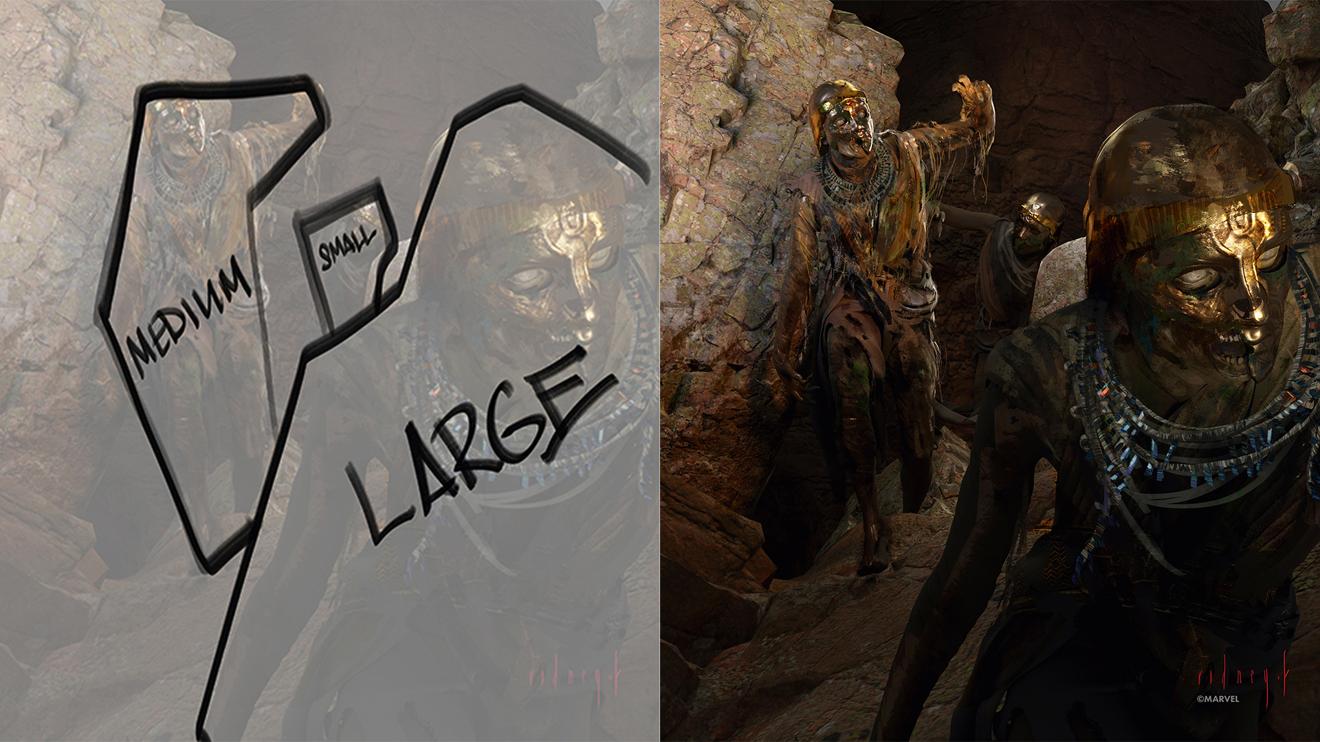
01. Work with small, medium and large shapes
(Image: © Marvel/Rodney Fuentebella)
When I do character pieces, I use the idea of small, medium and large shapes, not only in design but in composition. Creating different shapes for the figures and forms helps bring variety to the piece. I always struggle to use this idea because my brain wants to have similar shapes and sizes of figures, forms and so on. I always want to show every aspect of every character, but so often less is more.
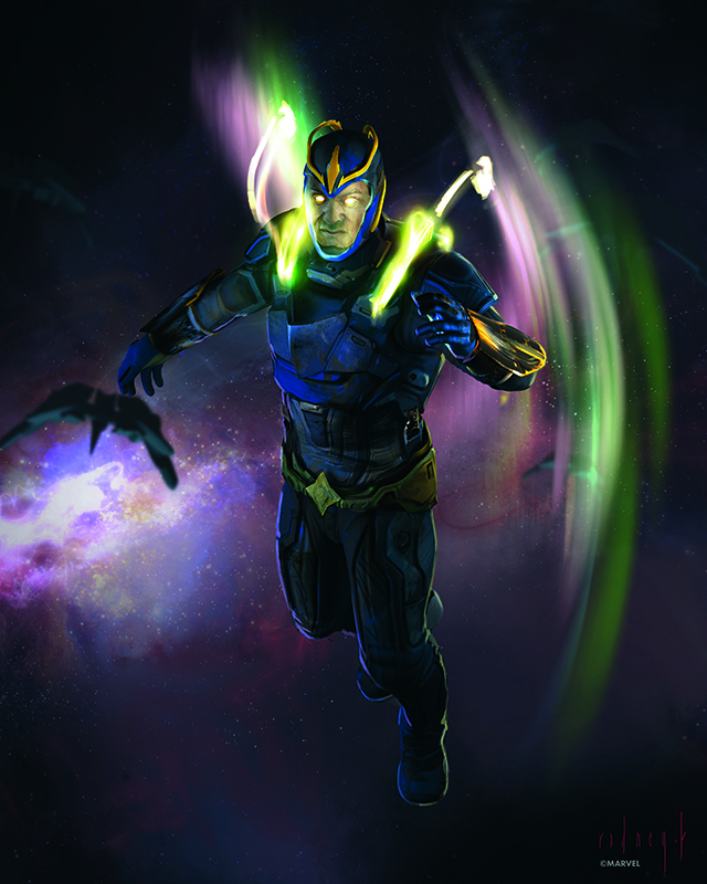
02. Have fun with effects
(Image: © Marvel/Rodney Fuentebella)
I love putting special lines and gestures in the effects I create. These gestures are the fun part of the pieces I do. I try to make the effects have a through line that helps bring the piece together and create excitement in it. The character design is the most important part of the process, but effects are cool to do. Rendering these effects is kind of like the ice cream I have after a hard workout.
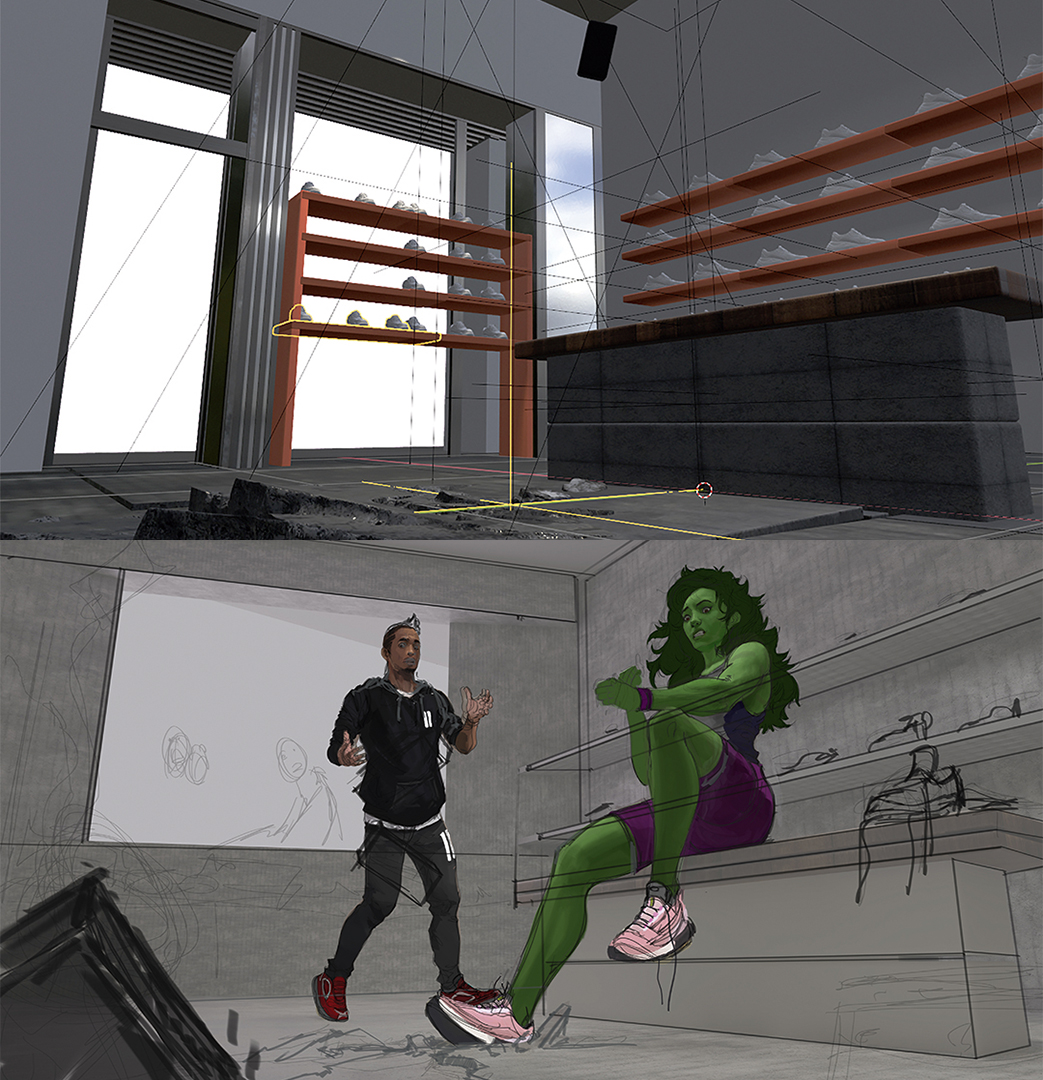
03. Use 3D software for environments
(Image: © Marvel/Rodney Fuentebella)
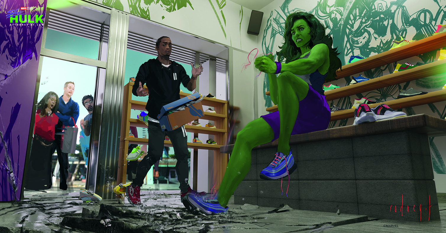
Interior shots are difficult to illustrate. When I have to deal with people, objects and multiple vanishing points, I use 3D tools to do a lay-in of the setting, plus whatever I think would be a pain to figure out the size and position of in the environment. I have to remember the software is a tool and that I still have to make a scene that shows the right mood. However, knowing that I don’t have to worry much about the placement and perspective of the room helps me out a lot.
04. Have an anchor for readability
(Image: © Marvel/Rodney Fuentebella)
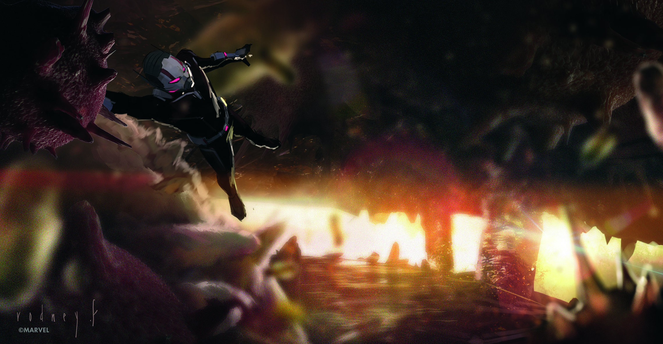
For these shots in Ant-Man and the Wasp, the environment was nothing relatable to our world, so I had to make sure that there was an anchor, in this case our main character. Having a character within a scene makes the scale and perspective easy to understand. I also heavily separated the foreground from the background to create a sense of depth and make the image as readable as possible.
05. Experiment with colour and shapes
(Image: © Marvel/Rodney Fuentebella)
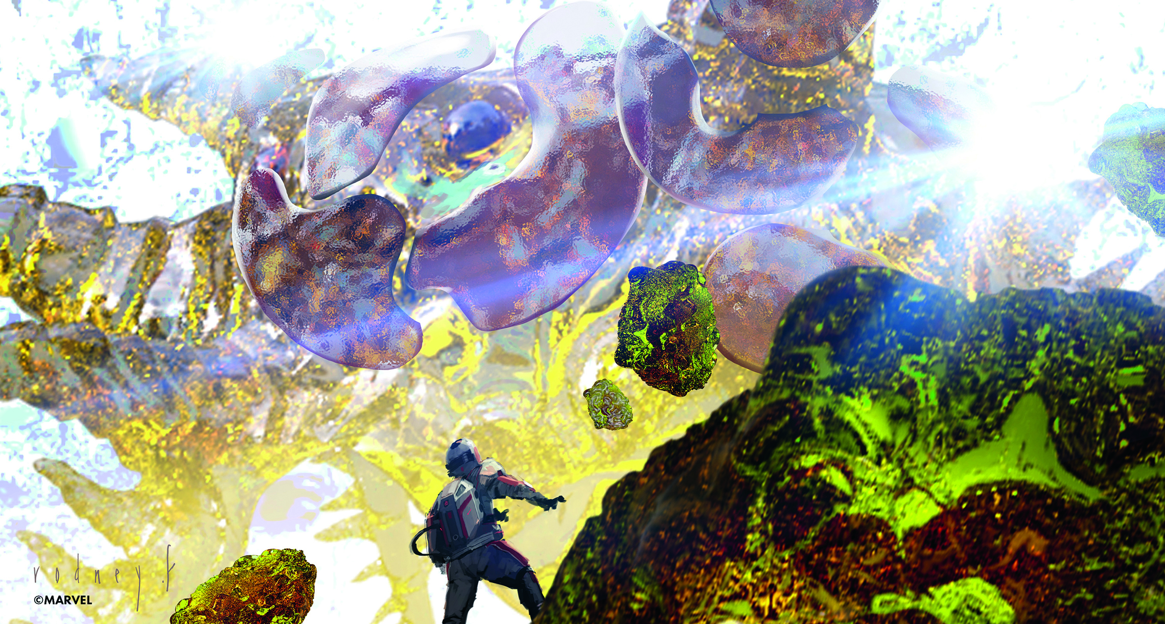
When I’m given the opportunity to think outside the box, I like to go for broke! I try out a bunch of different ideas and a lot of them don’t work out, but some that make the grade are kind of cool. I love playing with unique colour and shape combinations to see what sticks. It can be scary to experiment with ideas and colour combos that may look bad if we’re thinking traditionally, but who cares! I’ll try them anyway.
06. Combine warm and cool colours
(Image: © Marvel/Rodney Fuentebella)
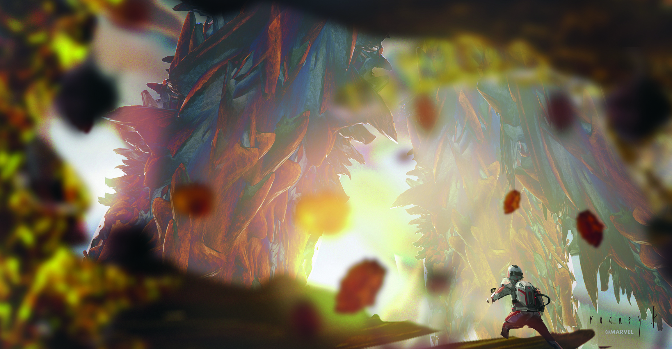
I remember my landscape painting classes where I was taught all about cools and warms; placing down a cool colour and thinking of where to put a warm one to complement it. I bring that idea into my concept work in subtle ways, and other times very obviously. Knowing these fundamental ideas and finding ways to incorporate them in my concepts is challenging, but often the result is a piece I’m happy with.
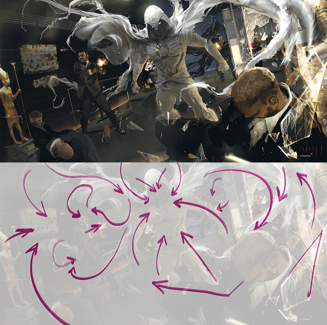
07. Find gestures to direct the eye
(Image: © Marvel/Rodney Fuentebella)
When I do complex illustrations showing something exciting, I find it easy to lose my focus and have to remember to ask myself what the main idea of the illustration is. Gesture is a key idea I use to keep me on track. It can be simple or complex as long as it directs the eye in a logical direction. I use lighting, action lines with loose clothing, poses and eyeline, and whatever else keeps the eye moving around the piece and back to the main idea.
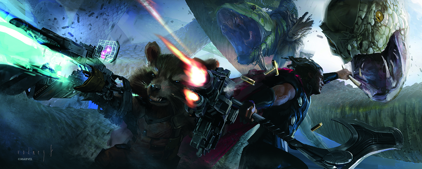
08. Make focal points
(Image: © Marvel/Rodney Fuentebella)
When I create keyframes with multiple main characters, I have to make sure that each of them is highlighted while still remembering to create a visual hierarchy. What that means is that some might be placed in the foreground and others in the midground or even in the background. Because of this, each character has something special that draws your eye to them.
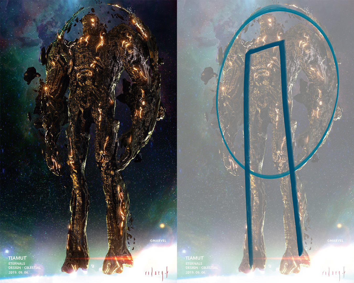
09. Think simple
(Image: © Marvel/Rodney Fuentebella)
When I create a concept, I have to think of the simplest way to best display the idea. In this example, I wanted the eye to encircle the character, so I made a circle motif
to bring my audience in and keep them there. I like to find a simple shape and try to see it through from the initial drawing or sculpt all the way along to the finished rendering and painting.
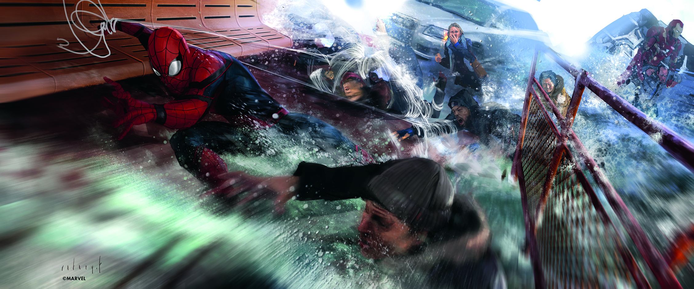
10. Consider how you build complexity
(Image: © Marvel/Rodney Fuentebella)
Once I have a simple idea laid out, the challenging dance of finding ways to add complexity while maintaining the concept’s simplicity begins. With every new gesture, expression, effect and detail, the more of the story I’m creating. But I also need to ask myself whether it complements the simplicity of the concept, or if these complexities just muddy the waters? Sometimes the answer is no, sometimes it’s yes. Aligning those complexities with the simple concept from the initial sketch is a both fun and frustrating part of the job.
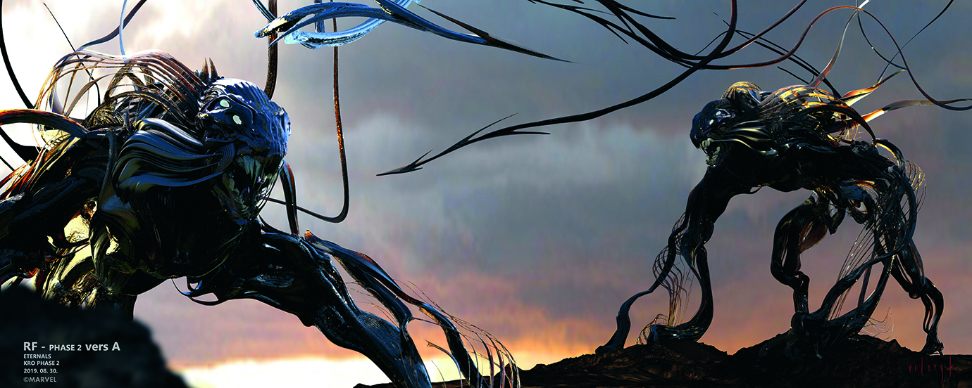
11. Try new ideas
(Image: © Marvel/Rodney Fuentebella)
For the design of the Deviants in Eternals, I wanted to try something new and, to be honest, I didn’t know whether I was wasting my time. These attempts at a concept are risky, but I felt that I had to try and think laterally from my normal ways of designing. Instead of thinking anatomically, I thought how an alien would construct an arm solely from making spaghetti-like parts. Strange I know, but why not!
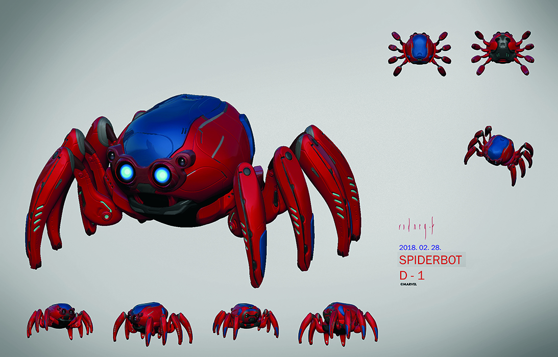
12. Find inspiration in your own experiences
(Image: © Marvel/Rodney Fuentebella)
When I create characters, such as cute spiderbots like this, I can’t help but draw inspiration from the world. Sure, I don’t have spiders as pets, nor do I have kids with glowing blue eyes, but I did notice how my kids look when they’re paying attention or being naughty. I noticed how a simple button on my phone makes it look sophisticated and friendly, which I put in a similar shape on the leg. I noticed how french bulldogs have a cute yet tough stance, which I put in one of the initial designs. Look all around and draw inspiration from the world; it’s everywhere!
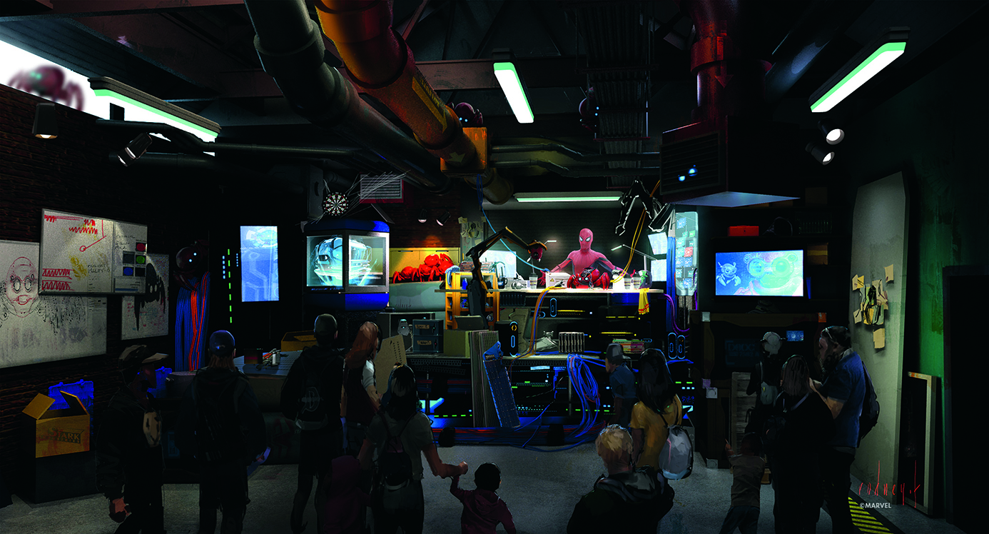
13. Organise with a one-point perspective
(Image: © Marvel/Rodney Fuentebella)
For busy shots like this where I have a crowd, spiderbots, hidden easter eggs, a mess on the table, sketches on the walls and mechs, I have to organise my thoughts. Sometimes a single point of view (POV) is super helpful for this. It makes the subject easy to find, and in the right height and size. On top of this, elements like long lights, fixtures and pipes create arrows that point to the subject thanks to the simple and direct one-point perspective.
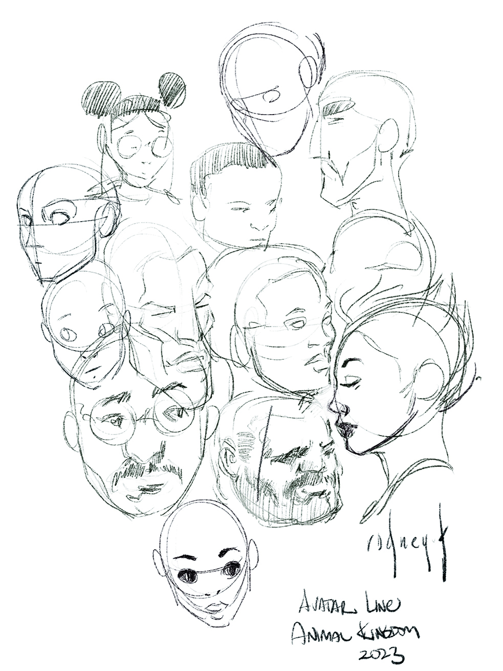
14. Make breaktime sketches
(Image: © Marvel/Rodney Fuentebella)
I guess this would be the equivalent of artistic meditation. I really don’t care if these sketches are good or bad. They’re for me, and that’s it. On some lunch breaks or when I know I’ll be waiting a while, I get some sketches in. I use this time to sketch away from the demands of work and let my artistic thinking go into a meditative state. These sketches are a way to unwind and think differently than how I’d go about work on concepts. Getting in a reset is a good thing for artists.
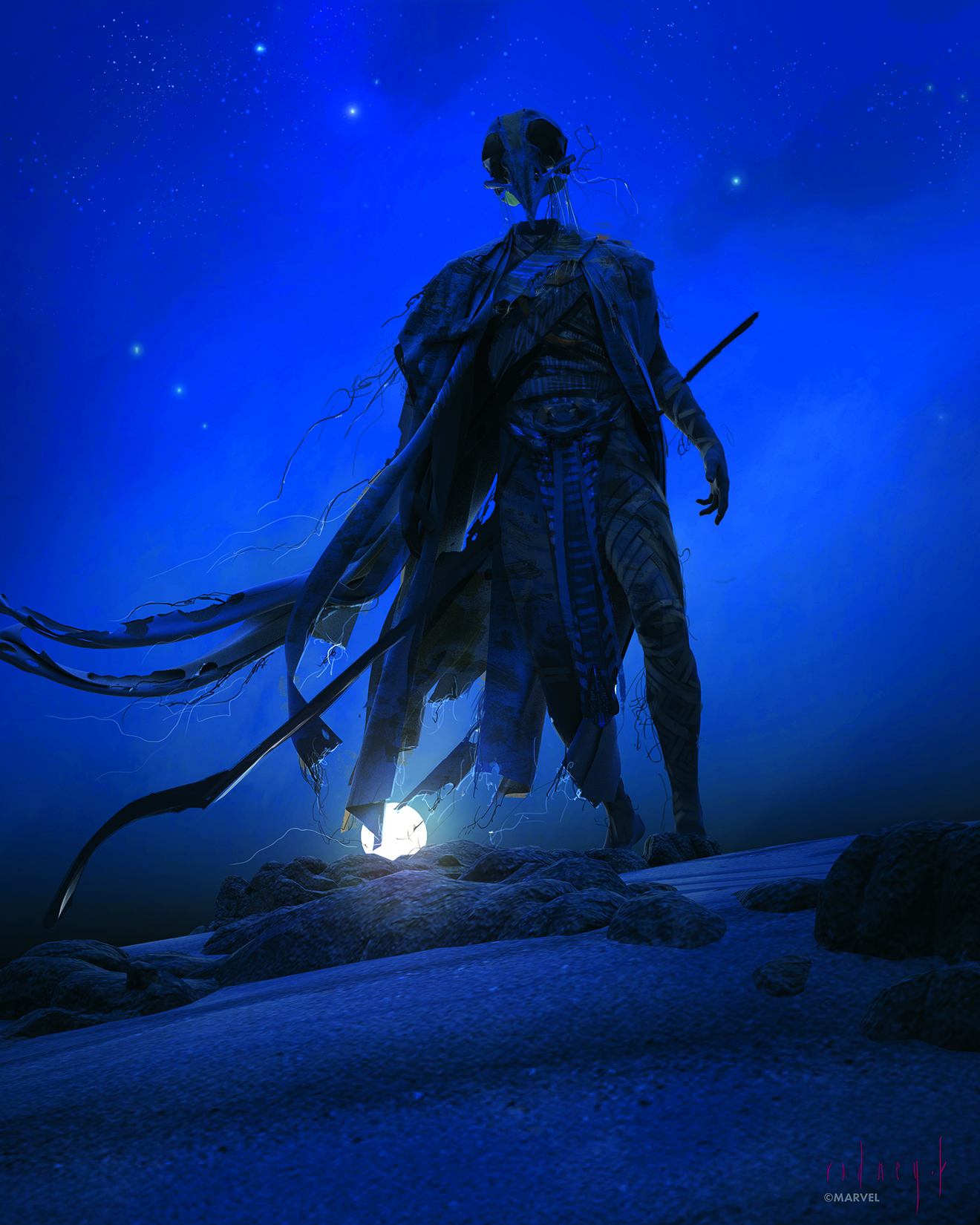
15. Create a mood for the character
(Image: © Marvel/Rodney Fuentebella)
For character design pieces, I want to display what the character means to the show and to me. For this one, I wanted a moody feel that makes the audience feel a little off and intimidated. That’s why I tilted the perspective, made the character look down on the viewer, and situated the highest contrast away from the face, which is unusual placement.
This article originally appeared in ImagineFX. Subscribe to ImagineFX to never miss an issue. Print and digital subscriptions available
Daily design news, reviews, how-tos and more, as picked by the editors.

