Stripping back a building to its key elements is something Sharon Tenenbaum is highly skilled at in her fine art architecture photos – both in camera and in Photoshop, as Ailsa McWhinnie discovers
When Sharon Tenenbaum stands in front of a building, or a cityscape, or a detail of a structure that has caught her eye, she doesn’t see what ‘normal’ people might see. Instead, her photographer’s perception kicks in, and immediately her eye begins to strip the scene of anything extraneous – her vision allowing her to see the bare bones of the construction and how that can be applied to an image. That the Vancouver-based photographer has a background in engineering doesn’t come as a huge surprise.
Her area of expertise was environmental engineering, and it’s a career she followed for some seven years before photography came calling. Feeling unfulfilled in her job, she resigned and went travelling around south-east Asia with a point-and-shoot camera her father had given her. “I had no clue about photography at the time,” she reveals, “but that little camera opened my eyes to a different way of seeing the world”.
When she told her boss she wanted to leave her job, he “thought I was joining the circus,” Sharon says, laughing. “But he bought me a laptop and told me to work from home until my photography took off”. Splitting her time between photography and engineering this way meant Sharon could “sleep at night knowing the bills were paid”. She continues, “It gave me the peace of mind to be able to pursue my art without having to think I need to make money from it”.
Developing a style in fine art architecture photography
Sharon describes those years spent dividing her time between engineering and photography as “like driving a semi-truck down the highway that you had to stop and drive in the other direction”. By this she means bridging the transition between using the more practical side of her brain and the creative one. But it had its benefits, too. “It’s what made me so versatile in terms of the creative process,” she explains. “I’m now really grateful for that.”
As she began to develop her style, there was always one thing at the back of her mind, and that was to avoid simply replicating what had gone before. While she did go through a period of using neutral-density (ND) filters and “living and breathing” long-exposure photography, it was always with the aim of using the technique as a means to an end, rather than an end in itself. This meant not allowing the technique to overpower the message of the image simply to create a beautiful shot.
A crucial moment came when she realised she could use her ND filters to downplay the sky in her images. “This allowed me to put the subject matter at the front of the stage rather than letting the sky steal the show.”
As for creativity, previsualisation is probably the single most important part of the shooting process – with Photoshop top of her post-processing priorities. “I always look for the bare bones of something,” she explains. “I guess I see things simplistically, without all the urban clutter. And my mind is very much subtracting from what I see in front of me, rather than adding to it, so I don’t notice the garbage cans, the foliage, the rails, the traffic lights… I notice something very specific and that’s what I want to show to the world.”
Sharon conducts a lot of workshops, and always says the same thing to her students:
“There must be a reason why you pick up your camera. When you’re in that moment, pretend you’re explaining to someone next to you what the one thing is that made you pick up the camera. That one thing is what you need to bring back in post.”
She’s not afraid of playing with her viewers’ perceptions, either. This is especially the case with the body of work she calls Inside Out. In it, Sharon creates composites whereby an interior scene is combined with a separate image of the sky, to make it appear as if it’s an exterior shot. It’s a highly considered process that results in a series of images that are intriguing and even a little puzzling to look at, and yet at the same time remain convincing.
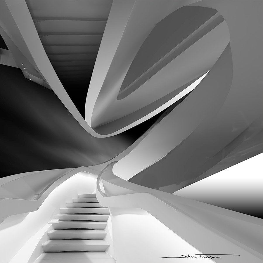
The image Design Museum, Israel (featured) is one example from this series, and demonstrates that what Sharon sees when she stands in front of a building or structure is more than an inanimate object. “In my mind’s eye, what I saw were fingers strumming a guitar,” she reveals. “I then brought in a separate long-exposure image of the sky and processed it to be like the strings of a guitar. I always ask myself what I am seeing in my mind’s eye, and that’s my roadmap into post-processing.”
And she doesn’t just choose any old sky to complement the architectural element of these composites. “I have a database of long-exposure skies,” she explains. “I find the sky to be a character in my plot or story, so finding the right one and selectively illuminating it is paramount. A lot of thought is put into the relationship of the sky to the structure; I hope it shows.”
Light touch
Recently, Sharon was listening to a podcast with Oscar-winning director Sarah Polley, and it was put to her by interviewer Debbie Millman that ‘time is a character in your movie’. This resonated with Sharon, who asserts that light is the main character in her images. When she is post-processing, foremost in her mind is the creation of a gradation of light, and the understanding of where it is coming from and where it is going.
To emphasise the quality of light, she stresses the importance of understanding the Gradient tool in Photoshop. But first, she uses the Pen tool to draw the exact area she will be working on. “For each image, I make these selections – such as the cables of the bridge (see Sundial 03 above) – then I convert to black & white to increase the contrast, and then I create gradient lighting. When I explain to my students what gradient lighting is, I say it’s the relationship between light and shadow to create something three-dimensional.”
Also crucial to Sharon’s work is the concept of negative space – the areas surrounding and between the main subject. These areas don’t have to be empty – a common misunderstanding – they simply have to form a shape independent of the main subject, thus bringing a life and depth of their own to the image. “It’s about getting the right breathing space,” Sharon explains. “I always tell people the sky is also a character. This is especially true of architectural photography where there’s a conversation between the sky and the structure.”
There is a playful streak that links the pictures in Sharon’s bodies of work. Many of her images tease the viewer and play with the experience of viewing an image. This is seen most overtly in a new series that she calls Mind Games (see Mind Games 4 (Twirl), above), where her aim is to give what she calls “a completely new interpretation” of a subject – often a well-known one. It is also the complete antithesis of the previsualisation process she applies to much of her other work. “For this, my vision comes in post-production rather than when I take the shot,” she explains. “It’s important not to hold too strongly to specific methods, so sometimes you just have to let it go and see where it takes you.”
In the case of Twirl, where it took her was from a single ordinary shot to an image that is created by duplicating, flipping, reducing opacity and making multiple exposures. With such an image, knowing when to stop is crucial, so how does she manage that aspect of it? Rather like a printer working in a traditional darkroom, where they’d leave a work print on the wall for a few days before looking at it again, Sharon recommends processing black & white images in a very dark room, then leaving it on the screen, turning off the room’s lights, and leaving the image there to ‘sit’ for a couple of days. “If you’re not going back to things that bug you – if you’re just looking at it and enjoying it, then it’s done,” she says.
An architect once said to Sharon that her images “don’t celebrate architecture – they celebrate the art in architecture”. At the time, she said she found it rather hurtful but as the years went by she realised it was a compliment. “That’s how I feel,” she says. “I’m not there to photograph architecture how you would see it in magazines – I’m there to show my artistic interpretation of a scene.” And on that front, she succeeds.
Sharon Tenenbaum’s top tips for fine art architecture
Understand Photoshop
You can’t consider yourself a serious photographer unless you know Photoshop. The production of a photograph doesn’t end when you click the shutter – the processing is as important.
Pen tool
In essence, Photoshops boils down to making selective adjustments to specific areas. By using the Pen tool I have 100 per cent control over the area I wish to modify. It’s as if I am holding a pen in my hand and outlining the exact area I wish to work on.
Gradient tool
A photograph strips a three-dimensional space into a two-dimensional flat depiction. With the Gradient tool, I can reintroduce volume and depth by adjusting tones and shadows, which is paramount in architectural photography.
Black & white
Take time to understand the finer details of black & white. Study how certain colours convert to certain tones, and use that to your advantage in Photoshop.
Exaggerate
Take what it is you like and give it a little more steroids. Even when you’re telling a story about something, you need to exaggerate what you’re expressing to reveal what caught your eye. But do it with measure.
Be different
Don’t imitate what you’ve already seen. You can stand on the shoulders of others, of course, but be sure to have your own voice so that if you build on someone else’s work you take it in a different direction.
Kit list for fine art architecture photography
Fujifilm X-T3
“I gave up on full-frame DSLRs,” Sharon says. “They were just too heavy, so I now shoot everything with a Fujifilm X-T3.” One of the biggest draws to Fuji was its external controls. “Many features are in old school analogue dials that are easily accessible, so you don’t have to dig deep into the digital menu to find them,” she says.
Fujinon XF 10-24mm F4 R OIS WR
“I live in the world of wideangle,” Sharon explains. She likes what she calls “big picture scenes”, saying she’s not a natural close-up photographer who can pick out small details. This is her most-used lens, which gives her the depth of field she needs for the scenes she shoots.
Fujinon XF 10-24mm F4 R OIS WR review
Fujinon XF 16-55mm F2.8 R LM WR
“When I need a little bit more, I use this lens, which allows me to zoom in and pick out more detail,” Sharon says. She also appreciates the lack of distortion when compared with the wider lenses.
Fujifilm Fujinon XF 16-55mm f/2.8 R LM WR review
ND filters
Sharon is never without her neutral-density filters, and uses Kase Wolverine Magnetic Circular Filters, which she says are game changers. Because they’re magnetised, they simply snap on and off, and don’t leak light.
Tripod
“They say a camera bag and a tripod are like the perfect man – you can never find them,” Sharon laughs. Her tripod of choice is the Manfrotto BeFree carbon-fibre travel tripod, which she particularly appreciates for its quick-release clips and the flexibility of the ball head that comes with it.
The best tripod to buy for your camera in 2024.
Sharon Tenenbaum
Sharon was educated as a civil engineer. Her love for structures is reflected in a vast body of works that celebrate more than mere architecture. But rather, the art in architecture. As an artist, Sharon has won numerous international photography awards; as an educator, she has taught group workshops from New York to Melbourne, as well as online. See more at www.sharontenenbaum.com.
Featured image: Design Museum, Israel. Canon EOS 5D Mark II, 24-70mm, 1/10sec at f/11, ISO 100. Image credit: Sharon Tenenbaum
Further reading:
