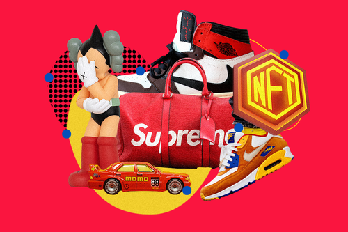
There’s a reason stop signs and stop lights are red. Red is widely considered to be the most eye-catching color, followed by yellow and orange. Studies have shown that the color red attracts and holds our attention more than other colors in both negative and positive contexts.
In graphic design and digital art, warm colors like red, yellow, and orange are used both to grab attention and elicit positive, passionate, energizing, or happy emotions. In contrast, cool colors are often used to elicit feelings of reservation, relaxation, or seriousness.
If your goal is to motivate someone to drop a lot of money, you’re often going to want to focus on the former. It’s no wonder, then, that reds, yellows, and oranges are so common in some of the most successful logos and branding campaigns—from McDonald’s and Coca-Cola to Target and Amazon.


