Summary
- Rob Liefeld’s art was defining for ’80s and ’90s comics, with big, bold illustrations that were both loved and critiqued.
- Outrageous depictions of characters, especially female anatomy, drew both ire and admiration for their unforgettable nature.
- Liefeld pushed boundaries with his unique style, featuring large, exaggerated characters and unconventional panel layouts.
One of the most popular figures in comics, Rob Liefeld has been equally cheered and jeered for his unique art and illustrations for Marvel. Whether it be Liefeld’s original take on backgrounds or panel layout to his extreme drawings of characters, his art always remained a singular comics reading experience. In a lot of ways, Liefeld’s drawing solidified the characteristics that made up a distinct era of comics art that was present from the late ’80s and throughout the ’90s.
Comics art in that era was big and bold, with Liefeld’s drawings arguably leading the charge. His covers and character presentations were no holds barred, which was known to draw ire from some. While Liefeld may have been lambasted for his—ahem—anatomically incorrect portrayals of women or his strained relationship with drawing feet, no one can ever say that Liefeld’s illustrations are forgettable, always being outrageous.
10 Domino & Boom Boom
Published in 2005

Criticized for his way of drawing female characters, Rob Liefeld lives up to the critiques with this drawing of two of his most prolific female characters. An outlandish portrayal of the female anatomy, this drawing shows anatomically bonkers proportions on the superhero powerhouses Domino and Boom Boom. With giant chests and abdomens too tiny to fit organs (you know organs, as in the things necessary to live), the illustration is a bit eye roll inducing. It would not be the first or the last time that Liefeld would be called out for outrageous depictions of the appearance of female characters, but this drawing remains a perfect example of one of the reasons why Liefeld is a complex figure in comics.
9 Captain America in Captain America Vol. 2 #1
Published in 1996

Steve Rogers is supposed to be an imposing presence, but the appearance of looking like he’s on stilts is a bit much as seen in this issue, part of the 1996 Heroes Reborn event. Captain America looks incredibly leggy, to the point of looking like a two-legged Daddy longlegs. The purple squiggles in the background add another interesting quality to the already outrageous page, cementing a surreal quality. There is a lot going on in the panels with a unique page layout as well, with three boxes on the right and then one very long panel with a very small panel just beneath it. Consequently, the drawing is an out-of-the-ordinary and offbeat work of Liefeld’s.
Captain America Vol. 2
#1 is written by Rob Liefeld and Jeph Loeb and penciled by Liefeld.
8 Thor & Hulk in Avengers Vol. 2 #5
Published in 1997

Despite being one of the most talked about creators in comics, readers have critiqued Liefeld’s drawing skills. This artwork from 1997 is one such example where some thought that Liefeld’s artistic talents did not do the action or story justice. For instance, people have pointed out the lack of hair movement as well as the obscuring of the dropping of Mjolnir, an important part of the story, as detriments to the comic issue. Both these critiques point out pretty crazy aspects of the illustration. Likewise, Hulk’s upper body looks absolutely massive. His biceps and shoulders look like there are muscles on top of muscles on top of muscles. Comics are, of course, not realistic, and nor should they be, but this drawing is a step beyond, going in an outrageous direction.
Avengers Vol. 2
#5 is written by Rob Liefeld and Jeph Loeb and penciled by Liefeld, Ian Churchill, and Chap Yaep.
7 Spider-Man in Spider-Man/Badrock Vol. 1 # 1
Published in 1997

Seemingly floating in space, Spider-Man looks like he’s in zero gravity. The purple background behind him adds to the spacey quality of the Spider-Man cover. The layout of the cover is on the strange side, with Badrock occupying the lower left corner, barely capturing the reader’s attention despite his name being in the title. It’s certainly an unconventional cover, especially for Liefeld, who usually liked to showcase guns and character drawings that take up the whole page. The positioning and setting of the cover remains an out-of-the-ordinary yet striking cover.
Spider-Man/Badrock Vol. 1
#1 is written by Dan Jurgens and penciled by Rob Liefeld and Marat Mychaels.
6 Domino in X-Force Vol 1. #9
Published in 1992

Technically, the Domino in X-Force Vol 1. #9 is actually the shapeshifting Copycat mimicking Domino, but for the sake of being easy to understand, the character will be referred to as Domino. In a fight scene, Liefeld’s white negative space in the background of this drawing adds a super dynamic look to the page, ensuring that the reader is focusing solely on the action. While having no illustrated background has been a point of contention for some comics fans, it must be mentioned that it is unique among comics, being another component of Liefeld’s art that sets him apart as an unorthodox and singular artist.
X-Force Vol. 1
#9 is written by Fabian Nicieza and Rob Liefeld and penciled by Liefeld.
5 Wolverine in Uncanny X-Men Vol. 1 #245
Published in 1989

The penciler for this totally rad ’80s comic, Rob Liefeld was tasked with drawing not just one, but multiple characters on the cover. There’s a lot going on in this image, as there are more than just characters on the cover, but guns as well. A lot of guns, as is expected from Liefeld. There are weapons coming in from every corner, making this drawing very energetic and nearly chaotic. Also, as Logan points out, he also has a spiffy jacket as drawn by Liefeld, a departure from Wolverine’s typical yellow and blue costume.
Uncanny X-Men Vol.
1 #245 is written by Chris Claremont and penciled by Rob Liefeld.
4 Cyclops in Marvel Comics Presents Vol. 1 #19
Published in 1989

Getting his start in the comics industry in the 1980s, Liefeld worked on a number of Marvel books, doing the covers for a range of comics properties like Spider Man. Likewise, he did the cover for the Cyclops-centered story, “The Retribution Affair (Part 3) – The Price of Retribution” from a 1989 issue of Marvel Comics Presents. From the beginning, readers would behold Liefeld’s distinctive drawing style that has been both applauded and attacked. This cover in particular is pretty outrageous considering Cyclops’s thighs look massive compared to the rest of his body, a common thread in many of Liefeld’s more outlandish drawings. Likewise, the purple fog emitting from him seems out of place and out of nowhere.
“The Retribution Affair (Part 3) – The Price of Retribution” is written by Bob Harras and written by Ron Lim.
3 Hulk in Avengers Vol. 2 #4
Published in 1996

Everything is bigger and bolder in Rob Liefeld’s universe.
Rob Liefeld was no stranger to extreme covers, featuring characters and weapons that were larger than life, even for the superhero realm. Everything is bigger and bolder in Rob Liefeld’s universe. This Hulk-centric Avengers cover is no different as the Hulk looks absolutely beefed up and in a complete rage. Looking bigger than ever, Hulk lives up to his reputation in this illustration. The cover is a testament to how ferocious Hulk can be, enticing the reader to turn the cover and get into the nitty gritty of the story.
Avengers Vol 2 #4
is written by Rob Liefeld, Jeph Loeb, and Jim Valentino and penciled by Chap Yaep and Ian Churchill.
2 Cable & Deadpool in Cable & Deadpool Vol. 1 #1
Published in 2004

Reputed for his inclusion of gigantic guns galore, Rob Liefeld’s Cable & Deadpool cover is the full-throttle kind of cover that fans have come to love and expect from Liefeld. Cable is huge, towering over the crouching Deadpool. It also helps that Cable’s shoulders are as big as a house, making him take up the majority of the cover through his body alone. The gun he’s holding is a large monstrosity as well, culminating in a drawing that is no-holds-barred. The sizes of everything (except for Deadpool) are dialed up to 11, and the result is a truly outrageous image.
Cable & Deadpool Vol. 1
#1 is written by Fabian Nicieza and penciled by Mark Brooks.
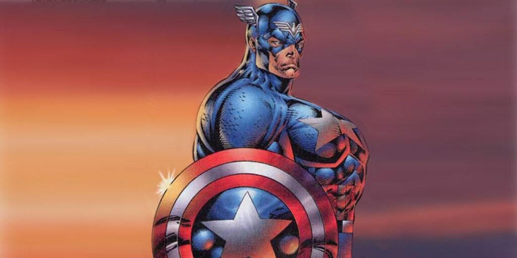
1 Captain America in Captain America Vol. 2 #6
Published in 1997

The extreme, abnormally large-chested version of Cap, on full display in this cover, was Marvel’s attempt at trying to boost interest in its characters with a new look. The move, however, did not go over as planned and was a detriment to both Marvel and Liefeld’s reputations.
Liefeld’s artistic interpretation of Captain America is infamous. Made barrel chested to the point of ridicule, Captain America had a pretty universally panned look when Liefeld debuted his take on the character. The extreme, abnormally large-chested version of Cap, on full display in this cover, was Marvel’s attempt at trying to boost interest in its characters with a new look. The move, however, did not go over as planned and was a detriment to both Marvel and Liefeld’s reputations. The cover of this late ’90s version of Captain America is notoriously outrageous, with many fans taken aback at the sight of the character when first seen. RobLiefeld’s effect on Marvel cannot be understated, both the good and the bad.
Captain America Vol. 2
#6 is written by Rob Liefeld and Jeph Loeb and penciled by Liefeld.